The world of customer service revolves around regular reports. These reports are necessary because data tells you fundamental things, such as volume of interactions, pickup rate, average handling time or customer satisfaction scores. Indeed, there are many different metrics that are relevant to your contact centre’s operations, but quality should outweigh quantity. With data visualisation, the best reports make raw data both easily digestible and instantly actionable. However, the amount of benefits you can reap is limited by the technology you use to create them.
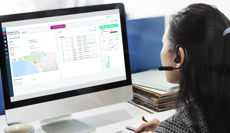
Not all reports are created equal, but data-visualisation dashboard software can help make those reports better. A dashboard is a display of relevant KPI information, customer data and actions to be taken, available to contact centre agents, supervisors and managers. They are highly customisable tools that both benefit and make real-time monitoring of analytics possible, which contact centres rely on heavily in this day and age. They can also be used on any device an agent or supervisor chooses.
Getting granular with data visualisation
One of the most attractive features of data visualisation dashboards is their granularity, or the ability of a task to be broken down into smaller tasks. Granularity manifests itself here through the unique perspectives that dashboards give every member of your customer service team from top to bottom. Contact centre supervisors can view the overall performance of agents and monitor aspects of customer experience (CX) such as success, effort and sentiment through KPIs like customer effort score (CES) and net promoter score (NPS). Managers on the floor can see how agents are performing by looking at target KPIs such as first contact resolution and problem resolution times. Agents, meanwhile, can know their total workload at a glance in terms of number of interactions and average handle times.
Even though they can display a wide array of statistics, it should be advised that contact centre dashboard software should not be used for surveilling agents. Bad workplace habits such as excessive surveillance contribute to an overall negative atmosphere and could lead to contact centre agent attrition. Instead, learning the ins and outs of data visualisation should be thought of as a skill to motivate agents and supervisors to take ownership of their results. When reports are treated more as a collaborative effort, team members are more likely to strive for continuous improvement.
Data visualisation helps you track metrics and make informed strategic decisions
Data visualisation software can be instrumental in tackling situation-specific interaction loads. Let’s take one of the busiest days in all of commerce: Black Friday. There are lots of reasons for an increase in inbound interactions on this particular day: transaction-related issues, order mixups, and the like. With the help of data visualisation, contact centre directors can use dashboard software to drill down on certain metrics like cost per interaction and create reports that give them insight on exactly how, where and when to deploy agents to maximise contact centre efforts to meet interaction surges.
Whatever relevant data your contact centre staff desires, your dashboard can be set up to look for it. Customer service departments can make use of customised dashboard software to see data that’s not only needed for smooth operation, but valuable raw data needed to gain an edge. Data visualisation tools can extract that value by allowing its users to drill down on different KPIs to get the insight needed to take action. They are playgrounds for curious and efficiency-seeking contact centre managers and directors. Knowing how to operate them could bring contact centres new insights and a better understanding of use cases that will help you deliver optimal CX and maximise your ROI.
However, the capabilities of data visualisation software are limited by a lack of knowledge or innovative enquiry on the part of those using it. The more time you put into learning how to identify and prioritise actions through it, the more insights you’ll gain. Data visualisation won’t necessarily make a poorly-performing contact centre efficient, but it can aid in making a good contact centre even better.
Is your contact centre in need of dashboard software?
Odigo gives its users a point of truth by providing them with a Contact Centre as a Service (CCaaS) solution with real-time analytics, reporting and visualisation that provides actionable and connected data across channels and resources. Once our team expertly and properly sets up your dashboard to meet your needs, your contact centre will begin reaping the benefits of the insights discussed in this post. From better insights come better customer experiences on all channels.